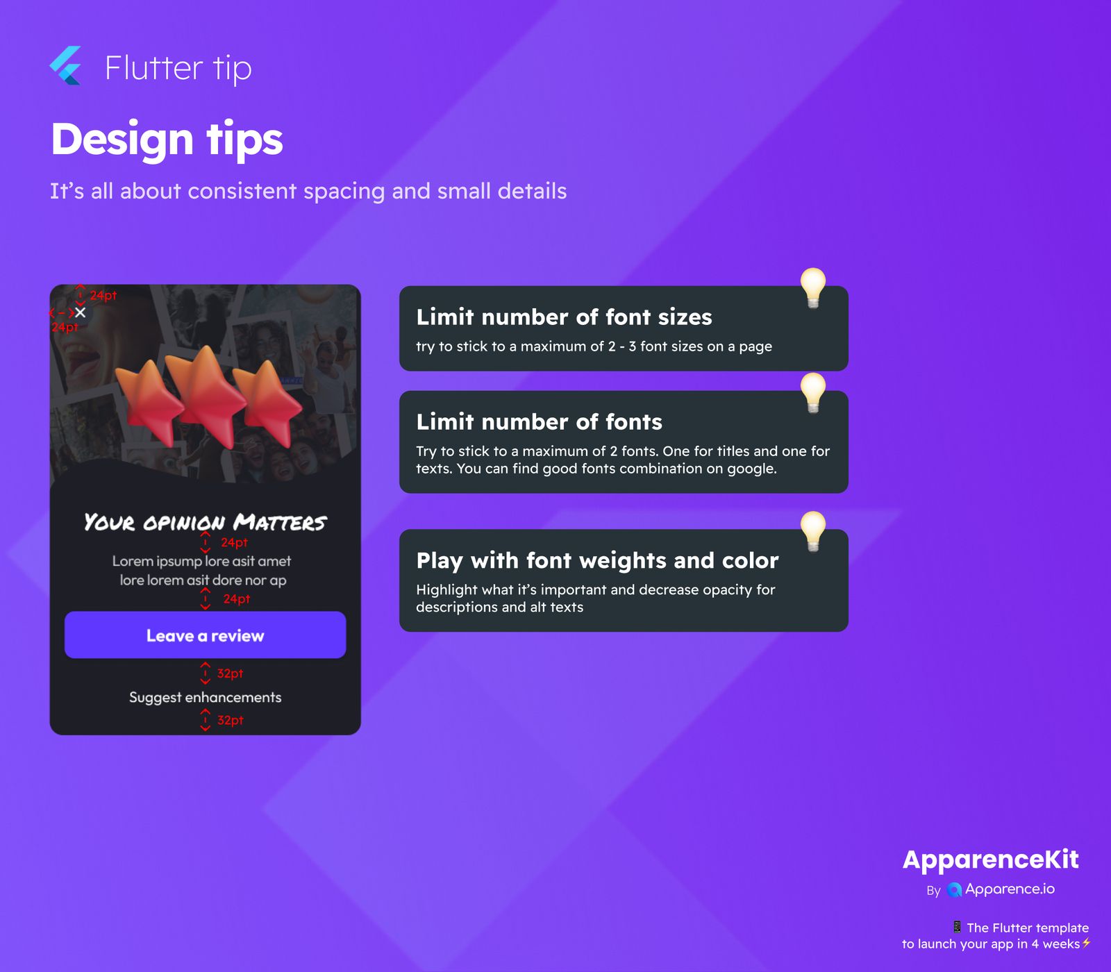
It's all about consistent spacing and small details when creating a great user experience. Paying attention to these small things can make a big difference in how your app looks and feels.
Simple Design Guidelines for Your App
Making your app easy and pleasant to use doesn't have to be hard. Here are some key areas to focus on for a polished design.
Keep Font Sizes Minimal
Having too many different font sizes on one page can make your design look messy.
Practical Advice:
Try to use only 2 or 3 different font sizes on any given page. This helps keep things neat and easy to read.
Don't Overdo It with Fonts
Just like font sizes, using too many different fonts can confuse the eye and make your app look unprofessional.
Practical Advice:
Stick to a maximum of two fonts: one for important titles and another for general text. If you need ideas, Google is a great place to find font combinations that work well together.
Use Font Weights and Color Smartly
Font weights (like bold or light) and colors are powerful tools to guide your users' attention.
Practical Advice:
Make important information stand out by using bolder weights or distinct colors. For less crucial details, like descriptions or alternative texts, you can decrease their opacity or use lighter colors. This helps users quickly grasp what's most important.
Remember, a clean and consistent design makes your app much more enjoyable to use!