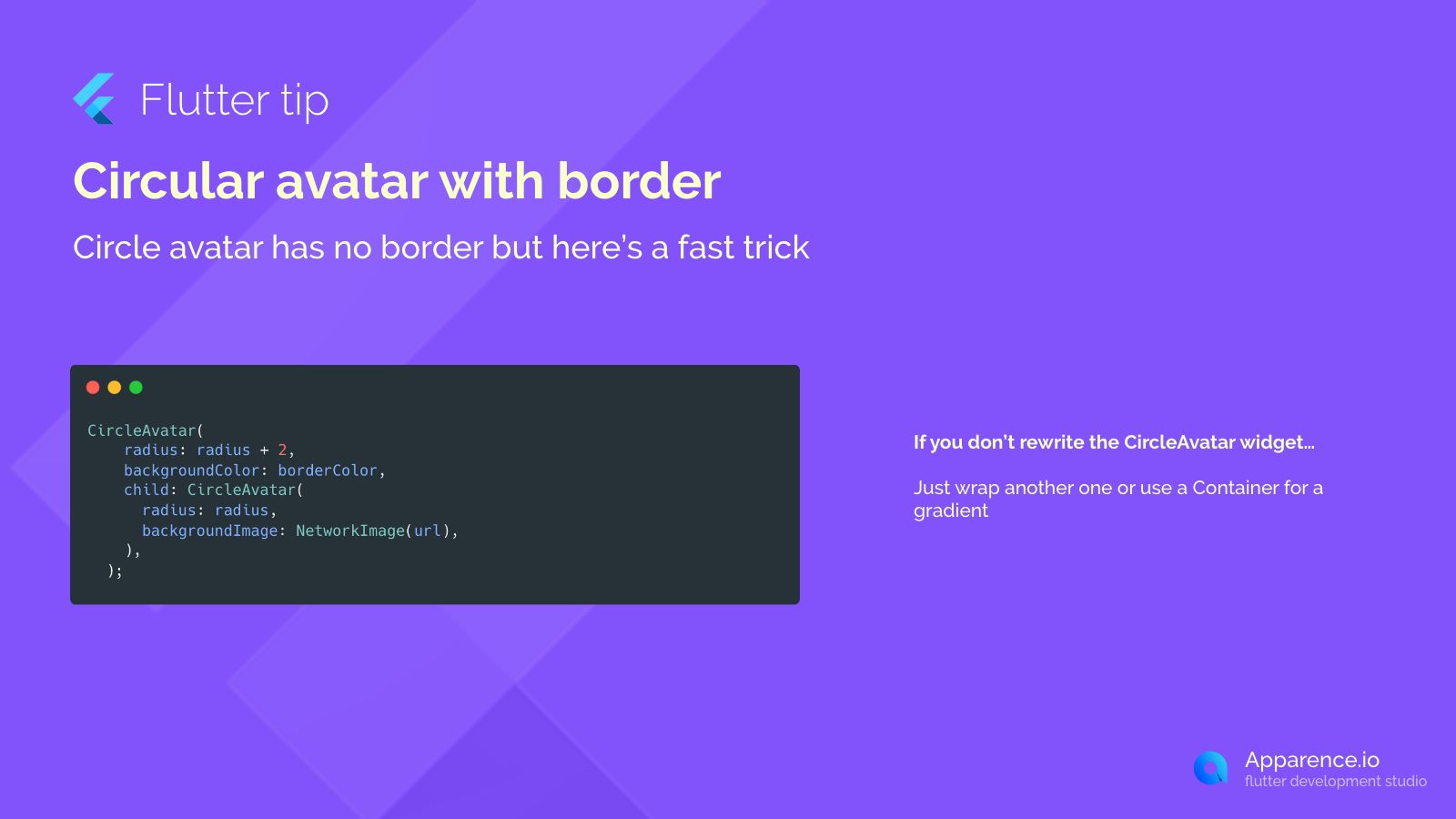
The Challenge with CircleAvatar
Flutter's CircleAvatar widget is great for showing circular images or user initials, but it doesn't come with a built-in way to add a border directly. If you need that extra visual touch, you might think you need a complex custom solution.
The Quick Trick for Borders
Luckily, there's a super simple trick to add a border without having to rewrite the CircleAvatar widget from scratch. The secret? You just wrap it!
Wrapping with Another CircleAvatar
One easy method is to wrap your main CircleAvatar inside another CircleAvatar. The outer one will act as the border.
Here's how it looks in code:
CircleAvatar(
  radius: radius + 2, // Make the outer circle a little bigger
  backgroundColor: borderColor, // This is the border color
  child: CircleAvatar( // This is your original avatar
    radius: radius, // Keep the inner circle the original size
    backgroundImage: NetworkImage(url), // Your image or child goes here
  ),
);
How This Code Works
The outer CircleAvatar is given a radius that's slightly larger than your main avatar's radius (like radius + 2). Its backgroundColor becomes the color you want for your border. The inner CircleAvatar is your actual avatar content (image or child) with the original radius. Because the outer one is bigger and has a background color, it shows up as a ring around your inner avatar – effectively creating a border!
Using a Container for More Styles
If you need more fancy border styles, like gradients or different shapes, you can also wrap your CircleAvatar inside a Container and use its decoration property. This gives you even more flexibility over the appearance.
This simple wrapping technique is a fast and clean way to give your circular avatars a border in Flutter.