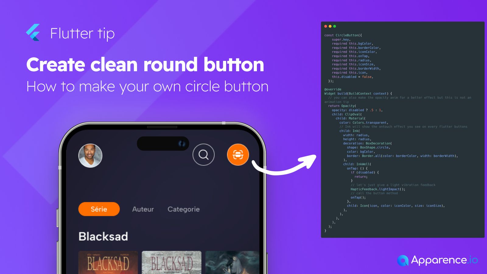
Building Your Own Round Button in Flutter
Sometimes, you need a button that looks just right. Creating a custom round button in Flutter gives you full control over its style and behavior.
Why Go Custom?
Standard buttons are great, but a custom widget lets you define every detail, like shape, border, color, and tap effects, exactly how you want them.
The Core Widget
The image shows a CircleButton widget. This is a custom class we create to hold all the properties and logic for our round button.
Understanding the Code
Inside the build method, several widgets work together:
Opacity: Used here potentially to handle the disabled state appearance.ClipOval: This makes sure its child is perfectly round.MaterialandInk: These help provide the visual feedback when the button is tapped, like ripples.BoxDecoration: Defines the shape (circle), background color, and border.InkWell: This is what makes the widget tappable. TheonTapfunction is where you add the action that happens when the button is pressed. It also includes a check fordisabled.
This structure allows you to create a consistent, reusable round button component throughout your app.