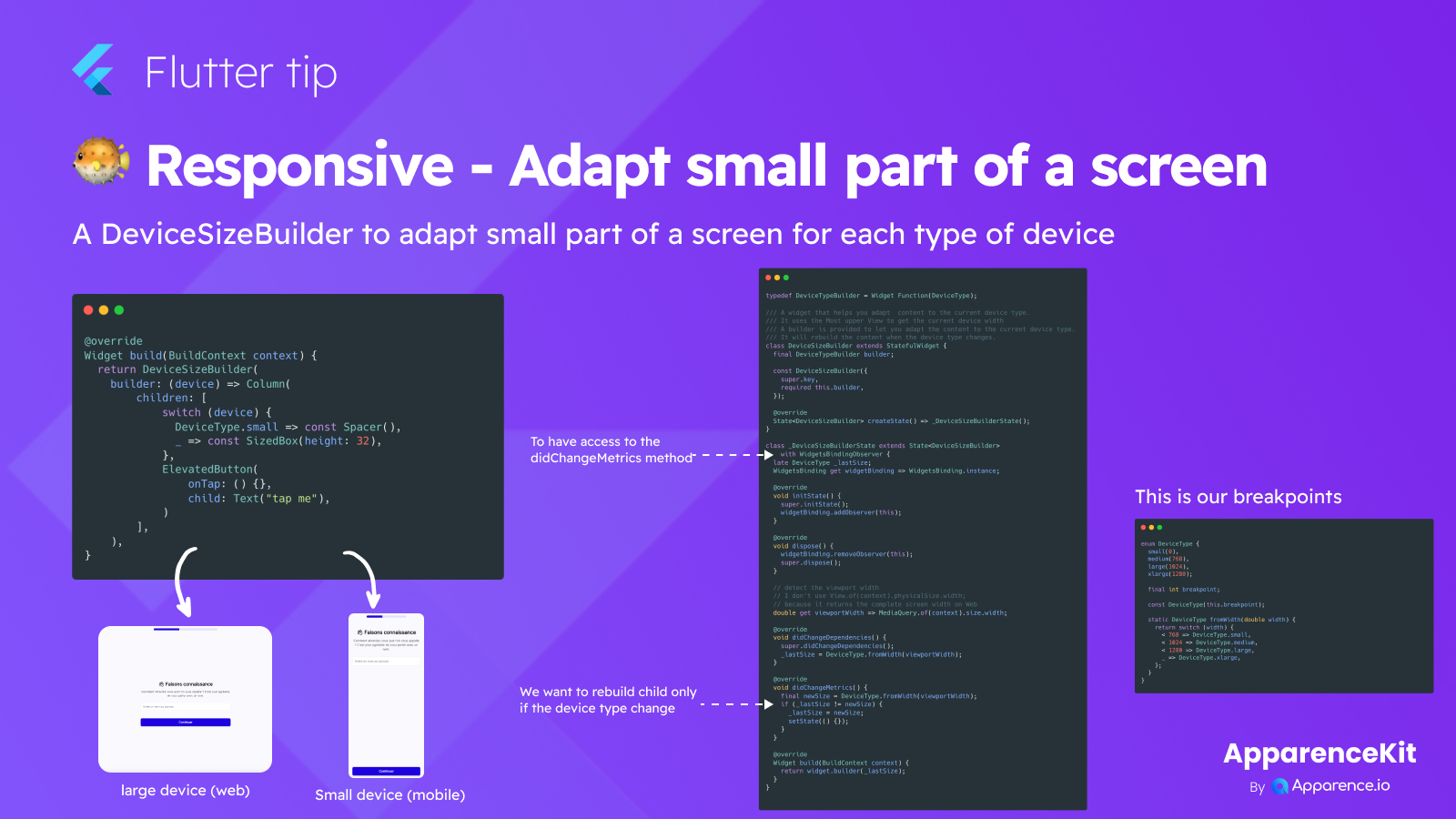
Building apps that look great on phones, tablets, and the web can be tricky. Sometimes, you only need to change a small part of your screen layout depending on the device size.
A handy way to do this in Flutter is by using a widget like DeviceSizeBuilder. This widget lets you check what kind of device (like small phone or large web) the user is on. Based on this, you can show different widgets or adjust spacing, but just in that specific section of your app.
It works by checking the screen size against predefined breakpoints. If the screen size crosses a breakpoint, the widget rebuilds, allowing you to show a different layout optimized for that new size.
This is super useful for making sure your app feels natural on any device without rewriting the whole page.
Here is the code for our breakpoints:
enum DeviceType {
  small(0),
  medium(768),
  large(1024),
  xlarge(1280);

  final int breakpoint;

  const DeviceType(this.breakpoint);

  static DeviceType fromWidth(double width) {
    return switch (width) {
      < 768 => DeviceType.small,
      < 1024 => DeviceType.medium,
      < 1280 => DeviceType.large,
      _ => DeviceType.xlarge,
    };
  }
}
And the code for the DeviceSizeBuilder widget:
typedef DeviceTypeBuilder = Widget Function(DeviceType);
/// A widget that helps you adapt content to the current device type.
/// It uses the Most upper View to get the current device width
/// A builder is provided to let you adapt the content to the current device type.
/// It will rebuild the content when the device type changes.
class DeviceSizeBuilder extends StatefulWidget {
final DeviceTypeBuilder builder;
const DeviceSizeBuilder({
super.key,
required this.builder,
});
State<DeviceSizeBuilder> createState() => _DeviceSizeBuilderState();
}
class _DeviceSizeBuilderState extends State<DeviceSizeBuilder>
with WidgetsBindingObserver {
late DeviceType _lastSize;
WidgetsBinding get widgetBinding => WidgetsBinding.instance;
void initState() {
super.initState();
widgetBinding.addObserver(this);
}
void dispose() {
widgetBinding.removeObserver(this);
super.dispose();
}
// detect the viewport width
// I don't use View.of(context).physicalSize.width;
// because it returns the complete screen width on Web
double get viewportWidth => MediaQuery.of(context).size.width;
void didChangeDependencies() {
super.didChangeDependencies();
_lastSize = DeviceType.fromWidth(viewportWidth);
}
void didChangeMetrics() {
final newSize = DeviceType.fromWidth(viewportWidth);
if (_lastSize != newSize) {
_lastSize = newSize;
setState(() {});
}
}
Widget build(BuildContext context) {
return widget.builder(_lastSize);
}
}