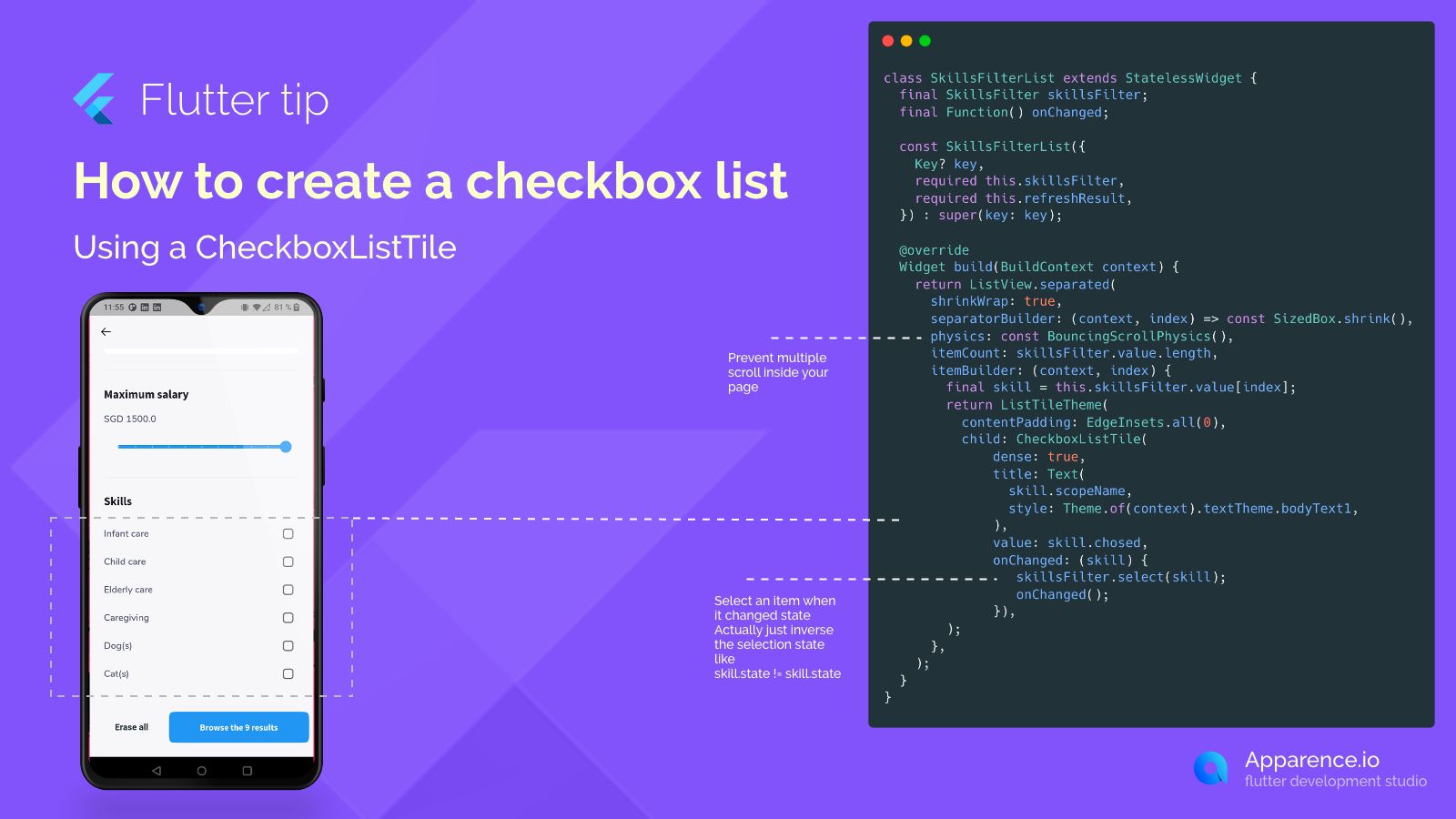
Building a List of Checkboxes in Flutter
Creating lists where users can pick options is a basic need in many apps. If you want a list where people can select one or more items, a checkbox list is a great way to go. Flutter makes making these lists quite simple using the CheckboxListTile widget.
What is CheckboxListTile?
Instead of putting together a text label and a checkbox separately, CheckboxListTile does it all for you in one handy widget. It includes a place for the item's name (the title) and the checkbox itself.
Putting it in a List
A common way to show a list of these is by using ListView.separated. This builds your list items one by one. For each item in your data, you'll create a CheckboxListTile.
Key Parts of CheckboxListTile
- title: This is usually text that describes the item, like "Infant care" or "Caregiving".
- value: This is a
trueorfalseswitch. If it'strue, the checkbox looks checked; iffalse, it's unchecked. - onChanged: This is super important! It's a little action that happens whenever someone taps the checkbox or the tile. Inside this action, you'll tell your app to flip the state of the item (from selected to not selected, or vice-versa) and then update the screen so the user sees the change.
Using shrinkWrap: true on your ListView is a good practice if this list is nested inside another scrollable view. It helps the list figure out its size correctly and prevents weird scrolling glitches.
By connecting the value to your item's current state and using onChanged to update that state and refresh the view, you can easily build interactive checkbox lists.