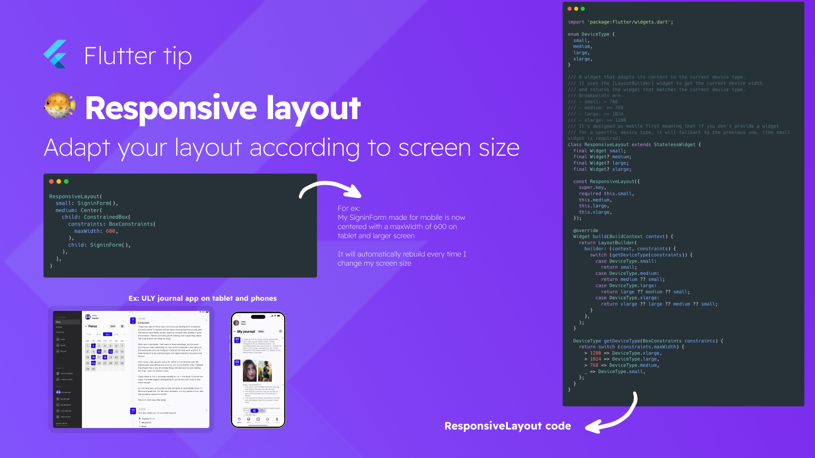
This Flutter tip illustrates how to create responsive layouts by building a custom ResponsiveLayout widget.
This widget uses Flutter's LayoutBuilder to access screen constraints (like maxWidth) and, based on predefined breakpoints, selects and renders a specific child widget tailored for that screen size (e.g., 'small', 'medium', 'large'). This allows developers to easily provide distinct user interfaces for different device types, such as phones, tablets, and larger screens, ensuring a better user experience across various form factors.