When it comes to building beautiful and responsive user interfaces in Flutter, understanding the concept of "Flex" is essential. Flex is a key component of Flutter's layout system, and it plays a crucial role in creating dynamic and adaptable designs for your mobile and web applications.
What is Flutter flex?
In Flutter, "Flex" refers to a widget that allows you to distribute available space along the main axis of a layout. The main axis is determined by the layout's direction, which can be either horizontal or vertical. Flex widgets are commonly used within a Row or Column widget to control how space is allocated to their children.
Column(
  children: [
    Flexible(
      child: Container(
        color: Colors.red,
      ),
    ),
    Flexible(
      child: Container(
        color: Colors.blue,
      ),
    ),
  ],
)
Notice the Flexible widget.
That's the widget that will allow us to distribute the available space along the main axis of the layout.
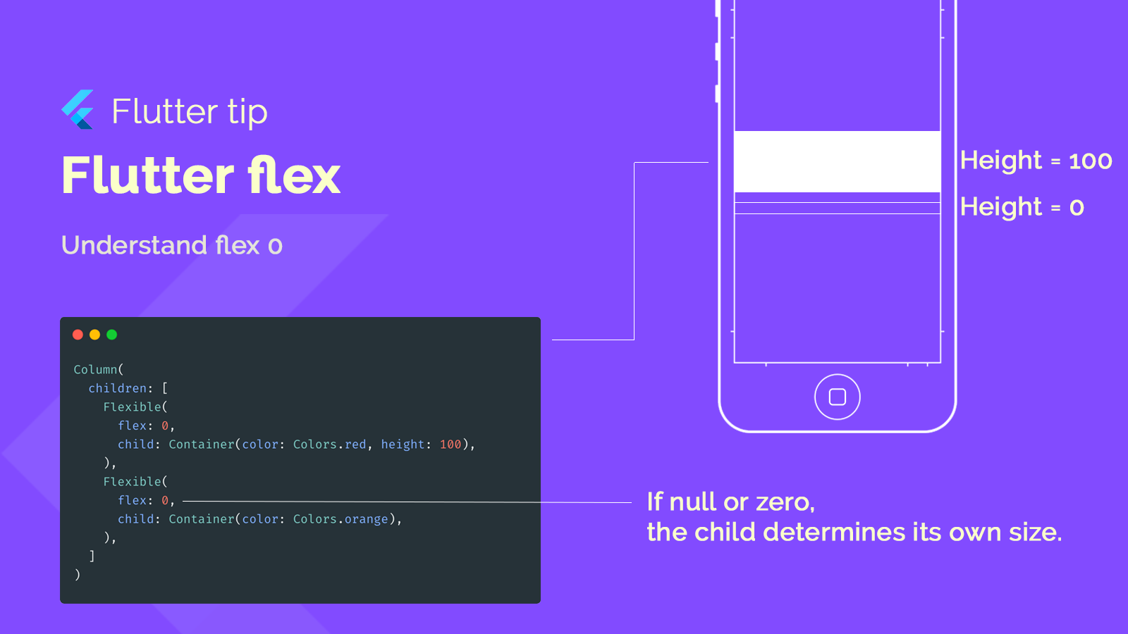
Flexible widget with flex factor equal to 1
By default Flexible element are set to flex 1. Flex 0 mean that the child determines his own size.
Expanded widget vs Flexible widget
Second container with a fit = tight will remain all available space. Expanded is basically a shortcut for this.
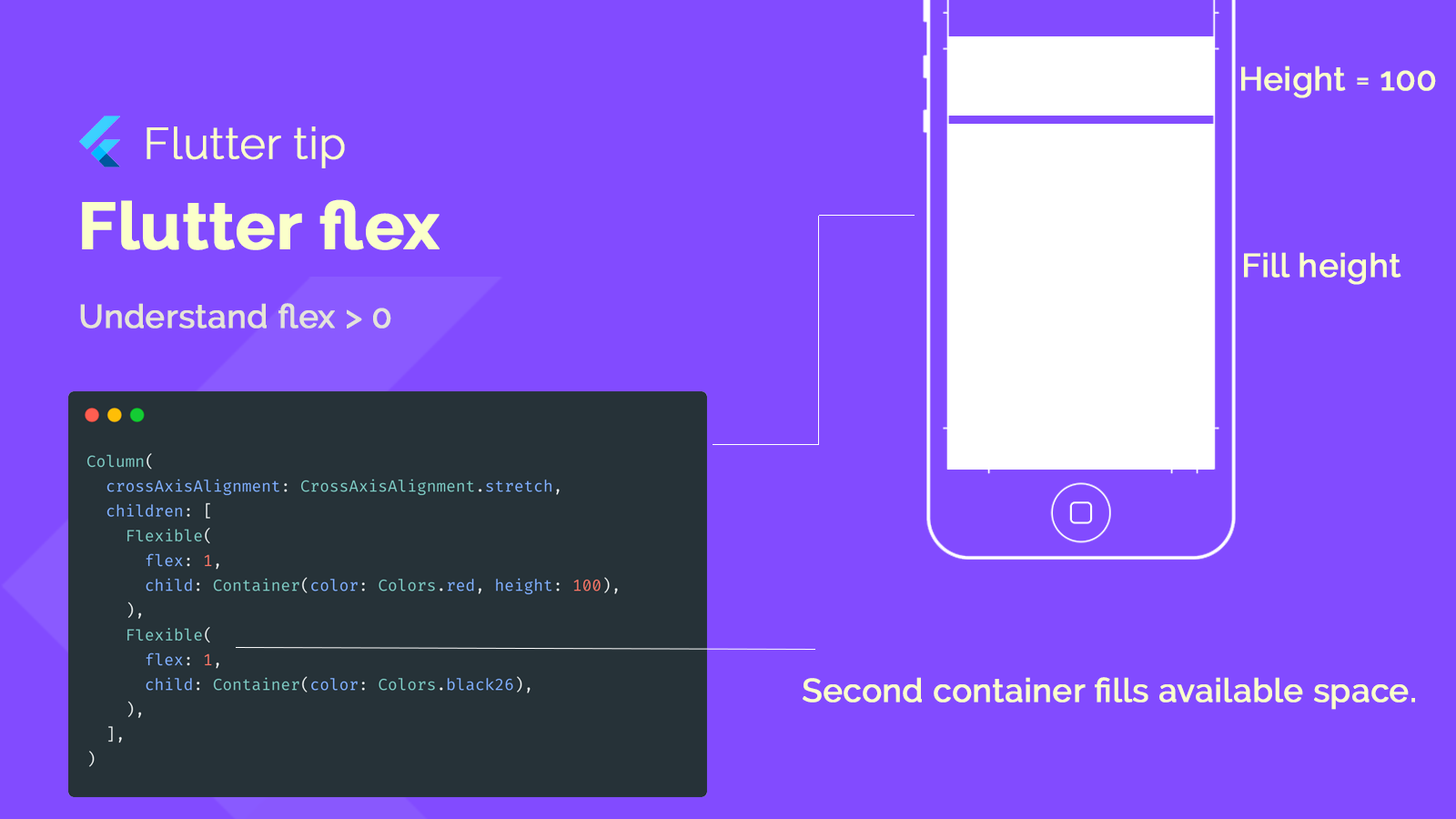
The Expanded widget has a fixed flex factor of 1. This means that when multiple children are wrapped in Expanded, they will share the available space equally. For example, if you have two children with Expanded in a row, each will receive 50% of the available space.
Flex factor
The higher the flex factor, the more space it will take.
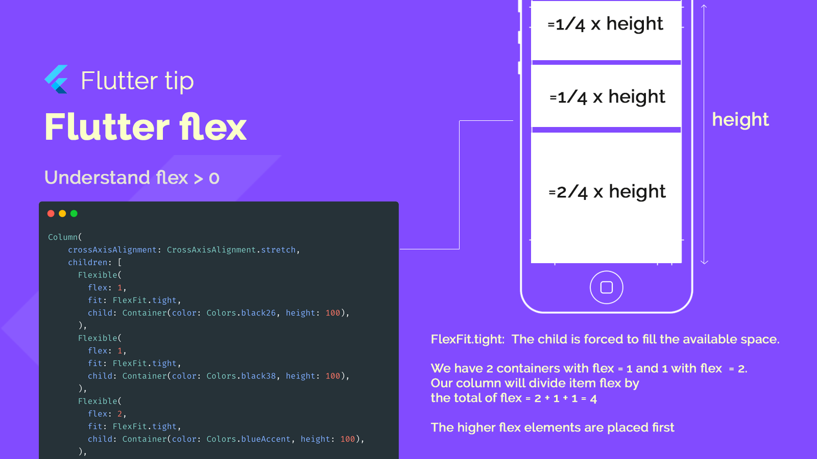
The height of each item is calculated by :
(item flex / total flex) * height
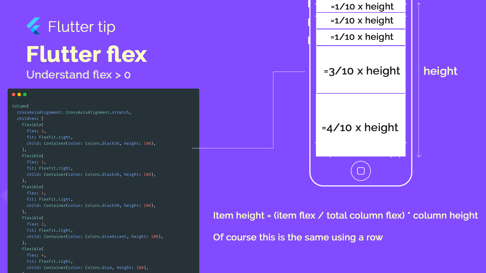
Now you have no excuse to not understand how your item are sized within your column and rows.
Benefits of Using Flex
✅ Responsive Design: Flex allows you to create layouts that automatically adapt to different screen sizes, making your app look great on a variety of devices.
✅ Dynamic UIs: It's easy to create dynamic user interfaces where the distribution of space among widgets can change based on different conditions or user interactions.
✅ Fine-Grained Control: Flex provides precise control over how available space is distributed, ensuring your design looks exactly as intended.
Flex is a powerful tool in Flutter for building flexible, responsive, and dynamic layouts. Whether you're designing for mobile or web, understanding how to use Flex effectively will help you create visually appealing and adaptable user interfaces for your Flutter applications.
