Setup your theme
Flutter provides you a way to customize your app theme.
It is extremely focused on material design but you can still customize it to fit your needs.
We worked on making it easier for you to customize it.
The main problems with the default flutter theme are:
- you create your theme directly without any factory
- you can't switch the theme without restarting the app
- you don't have a way to set different theme for different platform
We provide you a way to solve all these problems.
TLDR:
You can customize your theme by modifying only files located in (lib/app/core/theme/)
- colors.dart to setup your color palette
- text_theme.dart to setup your text theme
- universal_theme.dart to setup your theme from your color palette and text theme
- main file to setup your theme default mode
And that's it.
...If you want more explanation on how to customize your theme then keep reading.👇
Customize your theme
1. Setup your color palette
Open the colors file lib/app/core/theme/colors.dart and customize it to fit your needs.
Here is a simple color palette example:
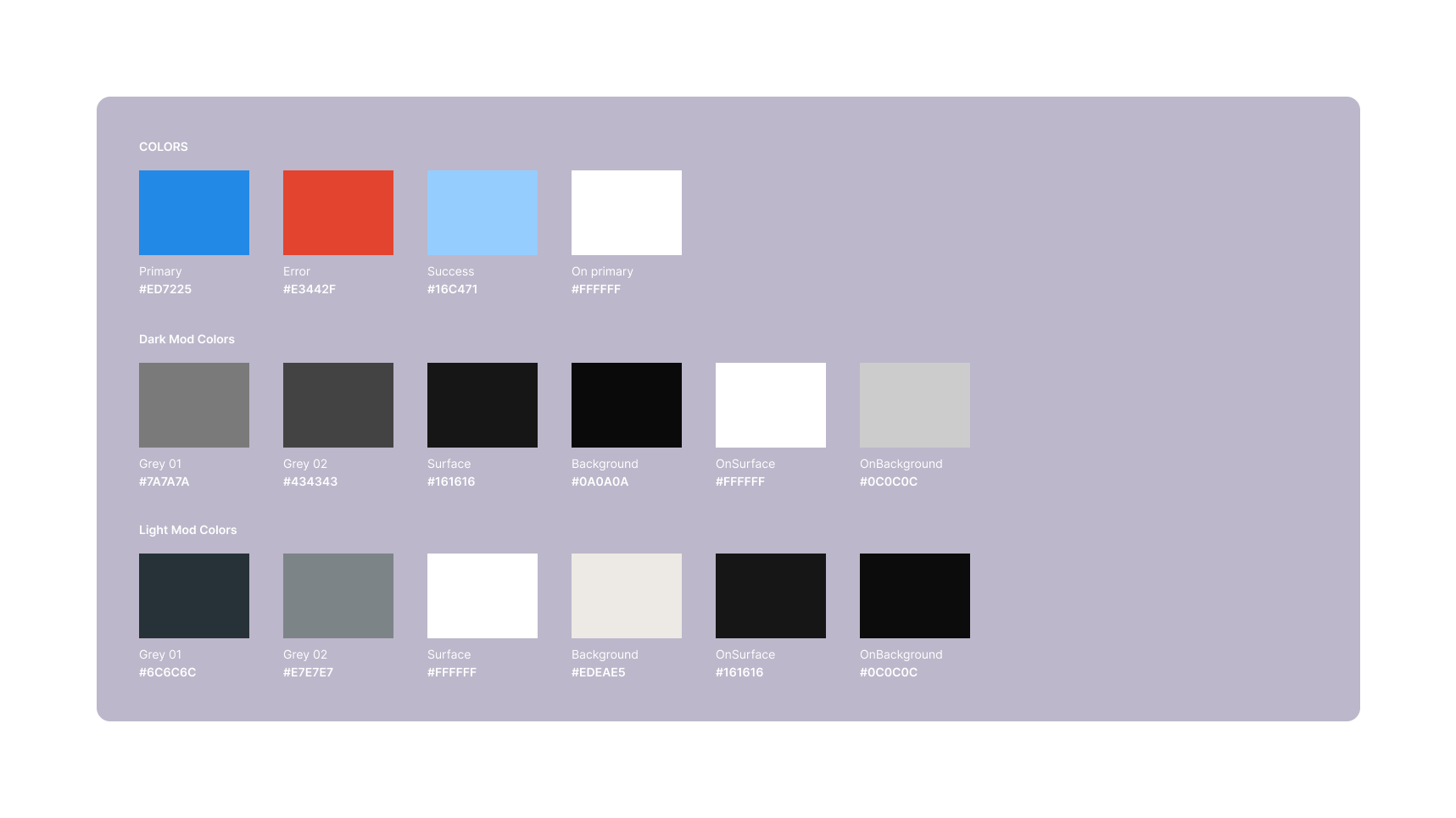
Some rules we recommend you to follow:
- Don't use too much colors. Most of the time one primary color is enough. You can add secondary, tertiary and accent colors if you want to, but this will be harder to create a great design. (You still have to )
- Try to stay close to this palette. (background, onBackground, surface, onSurface, primary, onPrimary, error, onError) that is used by the material design.
- grey01 to grey10 are used to create shadows. (grey01 is the lightest and grey10 the darkest)
- Flutter has a great premade color palettes that you can use. (Colors.blue, Colors.red, Colors.blueGrey...) it also provide great shades that you can access with the
shademethod. (Colors.blue.shade100, Colors.blue.shade200, Colors.blue.shade300...)
3. Create your own text theme
The file lib/app/core/theme/text_theme.dart contains the default text theme.
Most of the designers stick to maximum 2 fonts.
The point here is that when we make our app we want to always use the same fonts.
2. The theme factory
Motivation
ApparenceKit provides a factory to build your theme from a color palette and default text theme.
So instead of creating static color files or just copy pasting the colors across your theme you will be able to build your theme from a color palette, and default text styles.
After many apps we realized that most of the time Material Design is limiting us and we want to customize it.
A great design system handling darkmode and lightmode should only switch some colors.
👉 Don't redefine and maintain 2 different themes
The universal theme factory is a good example of how to create your own theme factory.
Check it out in the lib/app/core/theme/universal_theme.dart file.
Customize your own theme factory
First you need to create your own theme factory.
You can edit the UniversalThemeFactory and customize it to fit your needs.
Here is a cheat sheet to understand how our color palette is used.
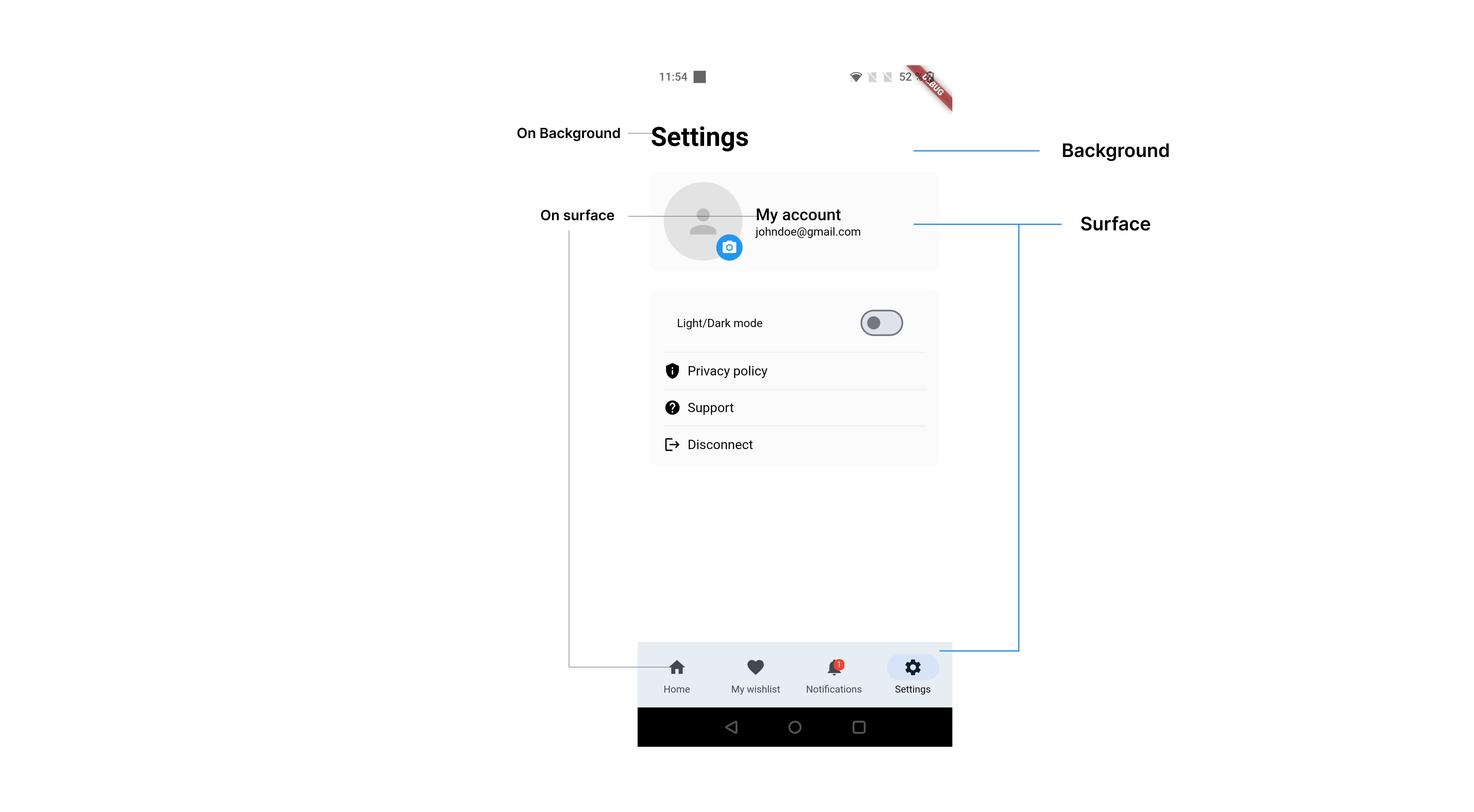
We will stick to some of the material theme rules.
- the background color is used for the background of the app
- the surface color is used for the background of the cards and every container that will be shown over the background
- the onBackground color is used for the text color over the background
- the onSurface color is used for the text color over the surface
- the primary color is used for the main color of the app (buttons, icons, ...)
- the error color is used for the error messages and the error state of the app
Then you can start adding you rules.
- If you want to add a Gradient then add it to the previous color file (
lib/app/core/theme/colors.dart).
Using the default text theme
The previously defined text theme is used to create the text theme of the app.
You can access it with defaultTextTheme.
TextTheme textTheme({
    required ApparenceKitColors colors,
    required ApparenceKitTextTheme defaultTextStyle,
  }) =>
      TextTheme(
        headlineLarge: defaultTextStyle.primary.copyWith(
          fontSize: 32,
          color: colors.onBackground,
          fontWeight: FontWeight.w700,
        ),
        ...
      );
Instead of doing this:
TextTheme textTheme({
    required ApparenceKitColors colors,
    required ApparenceKitTextTheme defaultTextStyle,
  }) =>
      TextTheme(
        headlineLarge: TextStyle(
          fontSize: 32,
          color: colors.onBackground,
          fontWeight: FontWeight.w700,
        ),
        // or
        headlineLarge: GoogleFonts.inter(
          fontSize: 32,
          color: colors.onBackground,
          fontWeight: FontWeight.w700,
        ),
        ...
      );
This way you will be able to switch the font of your app easily.
That's just a way to make it easier for you to customize your theme, of course you can still use it directly in the theme factory.
Setup your theme provider
The theme provider is a widget that will provide you the theme and the theme mode.
By default flutter doesn't have a way to switch the theme without restarting the app.
We provide you a way to do it easily.
This is our theme provider in the main.dart file.
return ThemeProvider(
    notifier: AppTheme.uniform(
        themeFactory: const UniversalThemeFactory(),
        lightColors: ApparenceKitColors.light(),
        darkColors: ApparenceKitColors.dark(),
        textTheme: ApparenceKitTextTheme.build(),
        defaultMode: ThemeMode.dark,
    ),
    child: Builder(builder: (context) {
        return MaterialApp(
            title: 'Flutter Pro Starter Kit',
            initialRoute: 'home',
            theme: ThemeProvider.of(context).light,
            darkTheme: ThemeProvider.of(context).dark,
            themeMode: ThemeProvider.of(context).mode,
            ...
        ),
    }),
);
🔁 Handling dark and light mode
By default ApparenceKit provides you a way to handle dark and light mode.
This is one of the reason to stick to the color palette we provided you.
Here is an example
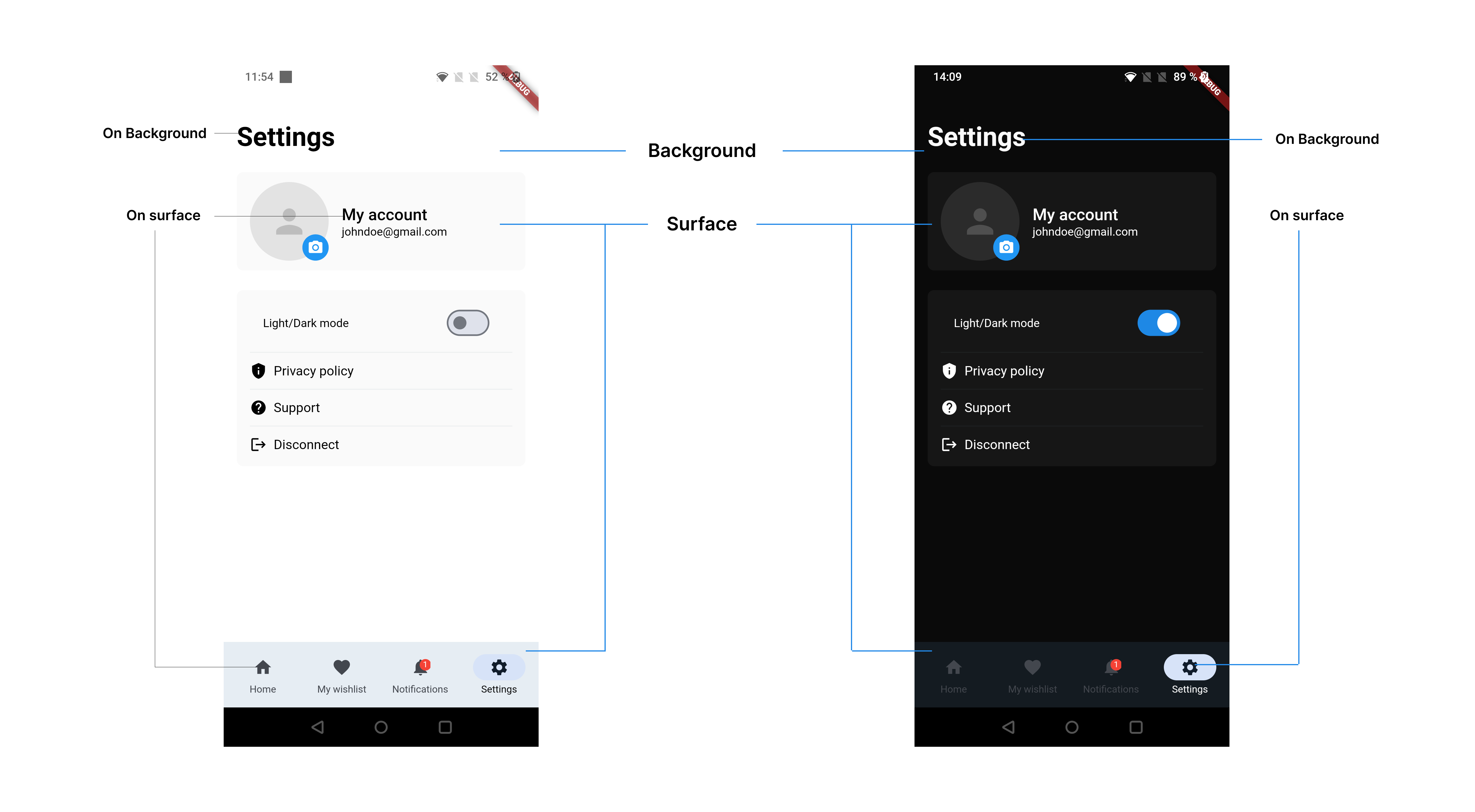
A great theme just have to switch some colors to fit the dark mode.
You can see that the background and surface colors are switched.
(👌 Note: we also took care of switching the System UI. So the status bar and the navigation bar will be switched to dark or light mode.)
If you don't want to use the dark mode then you can just remove it from the theme provider.
// lib/main.dart
return ThemeProvider(
    notifier: AppTheme.uniform(
        themeFactory: const UniversalThemeFactory(),
        lightColors: ApparenceKitColors.light(),
        darkColors: ApparenceKitColors.dark(), // remove this if you don't want to use dark mode
        textTheme: ApparenceKitTextTheme.build(),
        defaultMode: ThemeMode.dark, // don't forget to set default to light
    ),
    child: Builder(builder: (context) {
        return MaterialApp(
            title: 'Flutter Pro Starter Kit',
            initialRoute: 'home',
            theme: ThemeProvider.of(context).light,
            darkTheme: ThemeProvider.of(context).dark, // remove this if you don't want to use dark mode
            themeMode: ThemeProvider.of(context).mode,
            ...
        ),
    }),
);
Switch the theme (Dark / light)
To switch the theme you can use the ThemeProvider notifier.
ThemeProvider.of(context).toggle();Get the current theme mode
To get the current theme mode you can use the ThemeProvider notifier.
ThemeProvider.of(context).mode;📱 Handling a theme per platform
By default ApparenceKit provides you a way to handle a theme per platform.
Instead of using AppTheme.uniform we will use AppTheme.adaptive.
// lib/main.dart
return ThemeProvider(
    notifier: AppTheme.adaptive(
        defaultTextTheme: ApparenceKitTextTheme.build(),
        ios: const IosThemeFactory(),
        android: const AndroidThemeFactory(),
        web: const WebThemeFactory(),
        lightColors: ApparenceKitColors.light(),
        darkColors: ApparenceKitColors.dark(),
        mode: ThemeMode.dark,
    ),
    child: Builder(builder: (context) {
        return MaterialApp(
            title: 'Flutter Pro Starter Kit',
            initialRoute: 'home',
            theme: ThemeProvider.of(context).light,
            darkTheme: ThemeProvider.of(context).dark,
            themeMode: ThemeProvider.of(context).mode,
            ...
        ),
    }),
);
Then you can customize your theme for each platform.
To get started you can duplicate the UniversalThemeFactory and customize it to fit your needs for each platform.
Note: this also works with dark and light mode.
Customize your own theme
Adding colors or gradients to your theme
You can add gradients or gradients to your theme.
You can add it to the lib/app/core/theme/colors.dart file.
class ApparenceKitColors extends ThemeExtension<ApparenceKitColors> {
    final Color primary;

    final Color background;
    final Color onBackground;
  ...

    final Gradient primaryGradient;

    const ApparenceKitColors({
        required this.primary,
        required this.background,
        required this.onBackground,
        ...
        required this.primaryGradient,
    });

    factory ApparenceKitColors.light() => const ApparenceKitColors(
        primary: Color(0xFF6200EE),
        background: Color(0xFFFFFFFF),
        onBackground: Color(0xFF000000),
        ...
        primaryGradient: LinearGradient(
            begin: Alignment.topLeft,
            end: Alignment.bottomRight,
            colors: [
                Color(0xFF6200EE),
                Color(0xFF6200EE),
            ],
        ),
    );
Then you will find them in the theme factory like
lib/app/core/theme/universal_theme.dart file.
You will be able to build your theme from predefined colors.
How to add some theme properties
For example you want to create a new theme configuration for a widget named SoundCard.
open the file (lib/app/core/theme/theme_data.dart) and add your configuration here.
then you can use it in your widget like this:
SoundCard(
    title: 'Sound 1',
    subtitle: 'Subtitle',
    icon: Icons.music_note,
    style: context.kitTheme.soundCardTheme,
),
Note: You don't have to save all your widgets theme in this file. You can directly call your colors and text theme from the context.
This is just a way to group all your theme properties in one place.
Access your theme from the context
Access to the ApparenceKit theme shortcut
You can access your theme from the context.
We made some extensions to make it easier for you.
You can access the ApparenceKitThemeData from the context like this:
context.kitTheme;Thanks to the ApparenceKitThemeData you are not limited to the material theme.
context.kitTheme.colors.grey1; // Get the grey1 color from the color paletteAccess to the material theme shortcuts
Instead of calling
Theme.of(context).textTheme.headline1 // material headline1You can call
context.kitTheme.materialTheme.textTheme.bodyLarge; // material bodyLarge
// or
context.textTheme.bodyLarge; // material bodyLarge
(You can find the official documentation here.)